


Color Grading in Film: How to Nail the Cinematic Look in 2025

Take any travel vlogger's raw iPhone footage and put it next to a Netflix documentary of the same location. Same streets, same lighting, same scenes. But one looks like holiday clips while the other draws you into a story. The difference? Color grading.
Here's what most people get wrong, they think color grading is just about making videos look nice. It's actually about controlling how viewers feel. It's why a wellness brand's content feels calming while a tech company's feels sharp and energetic, even when both are shot in identical conditions.
In the UAE's creative space, where every brand is competing for attention on crowded feeds, getting color right isn't optional anymore. Whether it's a 15-second reel or a full campaign video, your color treatment decides if people stop or keep scrolling.
Why Color Matters So Much
Color grading controls how your audience feels. It's not just about looks.
DaVinci Resolve gives you control over exposure, contrast and color. But you need to understand what colors do emotionally.
Look at Blade Runner 2049. Orange means danger. Yellow means truth. That's what we should aim for in commercial work.
What's Actually Working in 2025
If you're producing content for brands here, these looks are getting results:
Bold Commercial Aesthetics
- High saturation for social
- Strong contrast stops mid-scroll
- Tech and lifestyle brands use this
Film Emulation
- Digital that looks like film stock
- That warm Kodak feel everyone wants
- Perfect when the brief says "authentic"
Soft Pastel Grading
- Gently desaturated with warmth
- Luxury and beauty brands love this
- Everywhere in fashion content
There's a shift toward hyper-realistic grading. Brands want authentic lighting and natural tones. This works well in commercial production for corporate and hospitality clients.
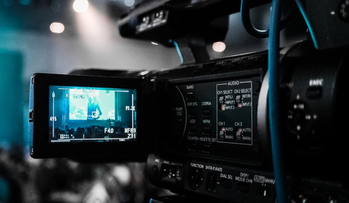
Getting the Technical Stuff Right
You can't fix bad footage in post. Shoot in log format so you have room to work later. Use proper reference monitors, not your laptop screen.
Start with technical corrections. Fix exposure, correct white balance, match your shots. Then get creative.
LUTs save time. We worked with a hospitality group and cut grading time by 40% across 12 videos. This is where professional color grading service makes the difference.
Skin Tones Can't Be Wrong
This is where work falls apart. Skin tones need to look natural. Too much magenta and people look flushed. Too much green and they look sick.
We isolate skin with masks and grade it separately. This way you can push creative looks everywhere else but faces still look real.
How New Tools Are Helping
DaVinci Resolve is the standard now. AI features handle boring corrections automatically so you focus on creative calls. Check out how AI is transforming video production to see where this is going.
HDR is becoming standard too. It gives you better control over shadows and highlights.
Start With Strategy
Before you open the software, know what you're communicating. What emotion fits this content? How does it match the brand's identity?
A wellness brand needs different color treatment than a fintech company. Color grading is one piece of your video marketing strategy, but it's the piece that makes everything else work better.
Making It Work Everywhere
Your grade needs versions for different platforms. What looks stunning on cinema screens gets crushed on Instagram. Create your master grade, then tweak for mobile and social.
Getting color grading right makes everything else in your content work harder. It's the difference between content people scroll past and content they actually remember.

WILD CAMEL HYPERMEDIA
Dubai, United Arab Emirates

Social
.svg)


.svg)
.svg)
.svg)
.svg)